-You’ve arrived at an intersection of design and analog photography. Welcome in.
-You’ve arrived at an intersection of design and analog photography. Welcome in.
-You’ve arrived at an intersection of design and analog photography. Welcome in.

-You’ve arrived at an intersection of design and analog photography. Welcome in.

-You’ve arrived at an intersection of design and analog photography. Welcome in.
Photographic Work
Everything that happened
Everything
that happened
on 30th February
on 30th February









Photography
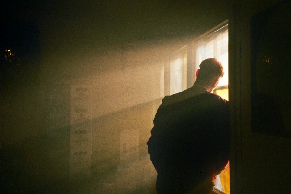
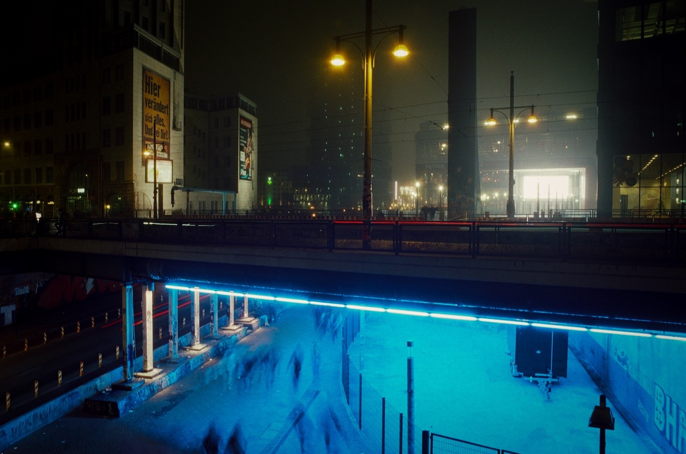
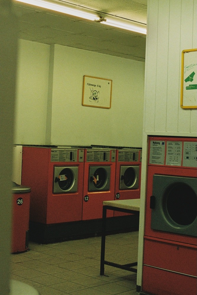
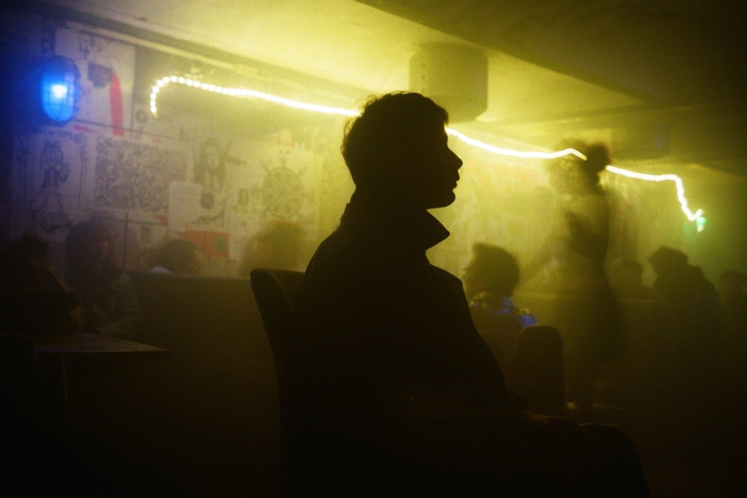
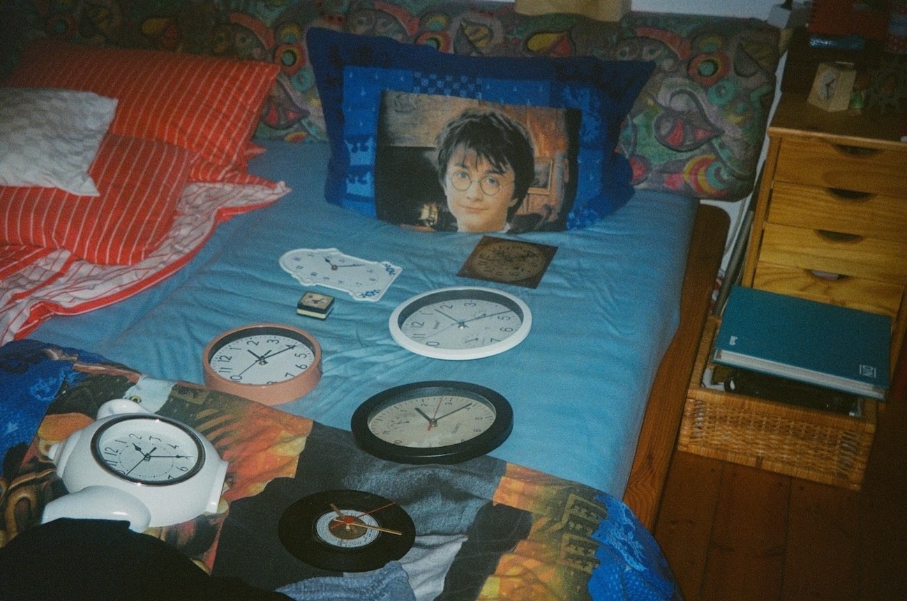
This virtual zine is a continuation of the first printed edition, produced in risography and titled "Everything That Happened on 30th February". It opens onto a parallel world, bringing with it questions about the fragility of reality...
Mini-zine, 2025 Virtual Edition & Printed on risography 90x130mm
Graphic Design
Selected Visual Work for Music Releases
Selected Visual Work for Music Releases
Industrial IDM
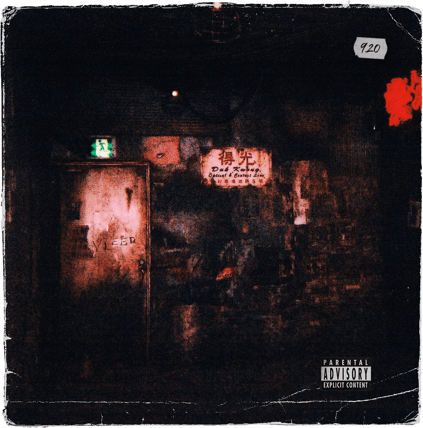
vleed
The Corner of Nothing

Industrial IDM
vleed
The Corner of Nothing

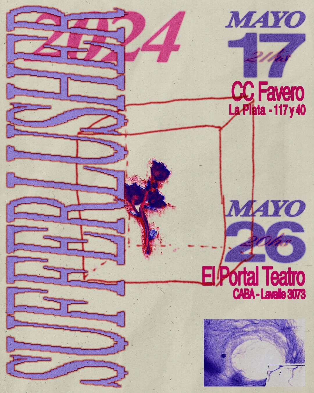
Shoegaze
Sufferlusher
Sufferlusher

Shoegaze
Sufferlusher
Sufferlusher

Droned Doom
Vanity Mirror
Secrets Untold

Droned Doom
Vanity Mirror
Secrets Untold
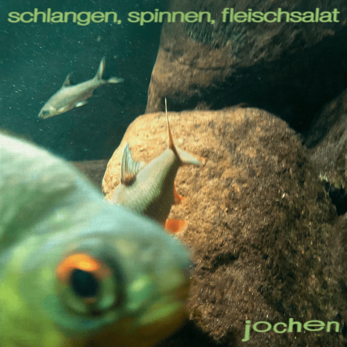
Alt-Punk
Jochen
Schlangen, Spinnen, Fleischsalat

Alt-Punk
Jochen
Schlangen, Spinnen, Fleischsalat
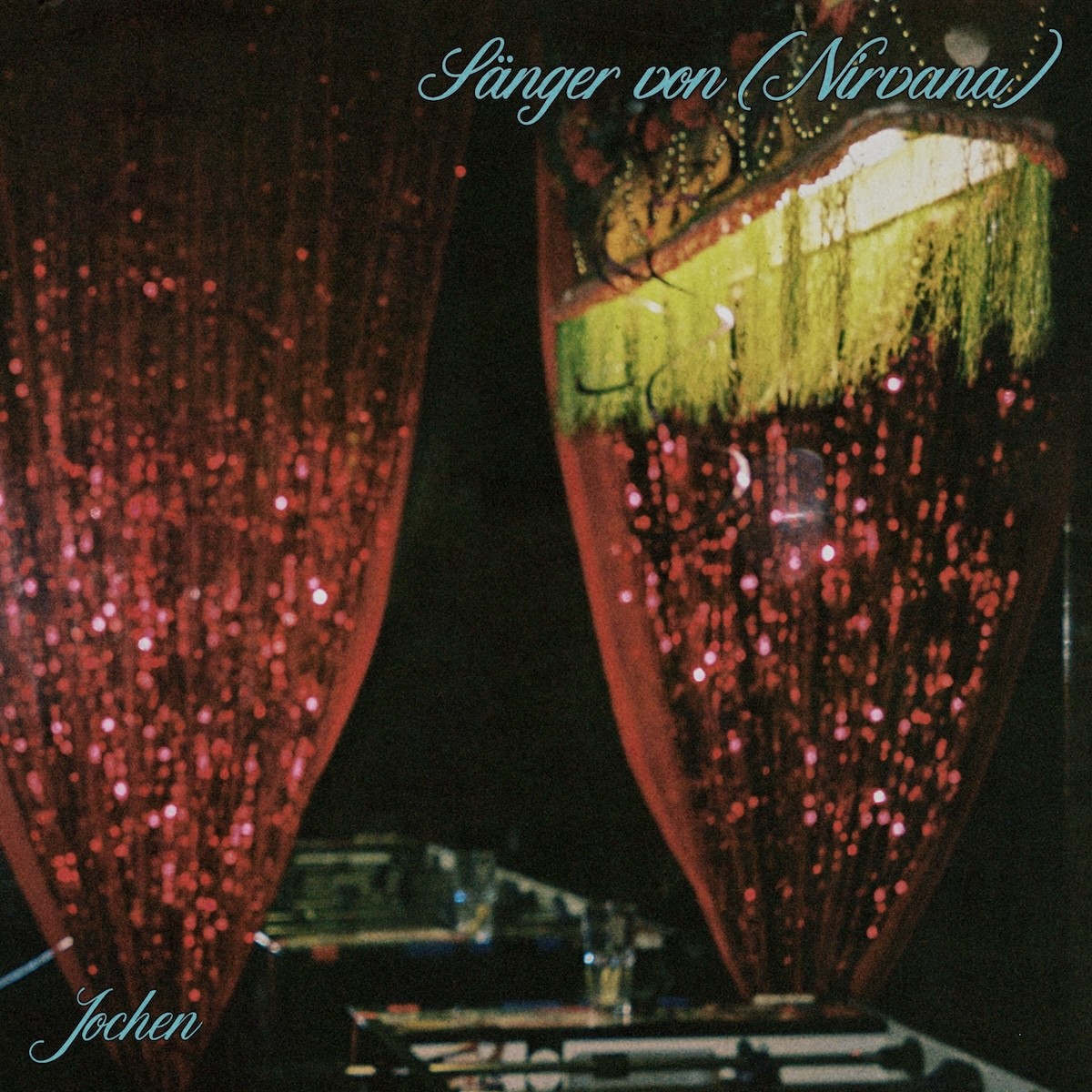
Alt-Punk
Jochen
Sänger von (Nirvana)

Alt-Punk
Jochen
Sänger von (Nirvana)
Graphic Design
Selected Visual Work for Music Releases

Industrial IDM
vleed
The Corner of Nothing

Alt-Punk
Jochen
Schlangen, Spinnen, Fleischsalat

Shoegaze
Sufferlusher
Sufferlusher

Alt-Punk
Jochen
Sänger von (Nirvana)

Droned Doom
Vanity Mirror
Secrets Untold
UX/UI Design
Selected Digital
Product Projects
Selected Digital
Product Projects
Selected Digital
Product Projects
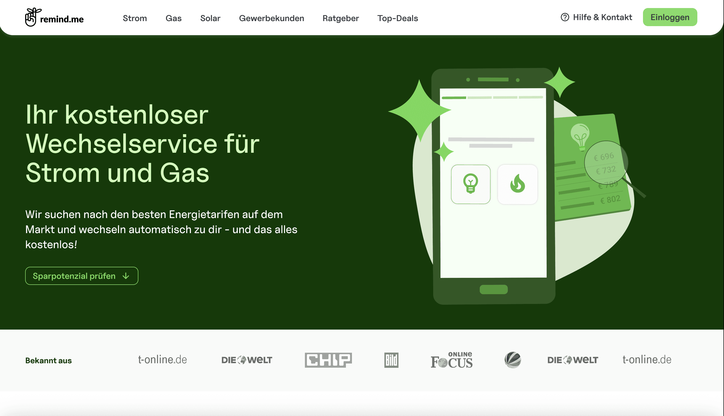
remind.me
A Simpler Way to Manage Energy Contracts
This project involved significant challenges in redesigning key conversion funnels. The initial focus was on analyzing, breaking down, and restructuring existing flow elements in order to reduce friction throughout the service subscription process.
remind.me
A Simpler Way to Manage Energy Contracts
This project involved significant challenges in redesigning key conversion funnels. The initial focus was on analyzing, breaking down, and restructuring existing flow elements in order to reduce friction throughout the service subscription process.
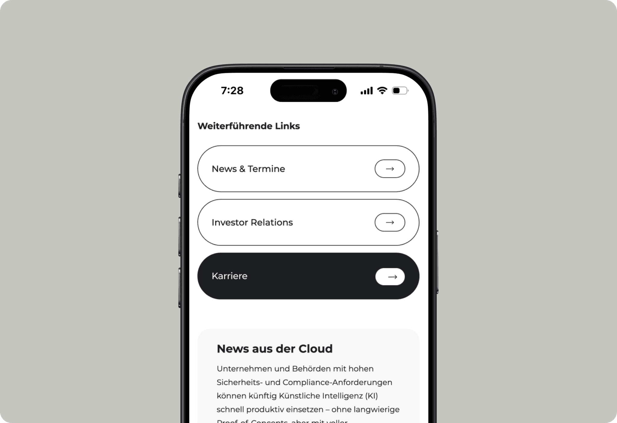
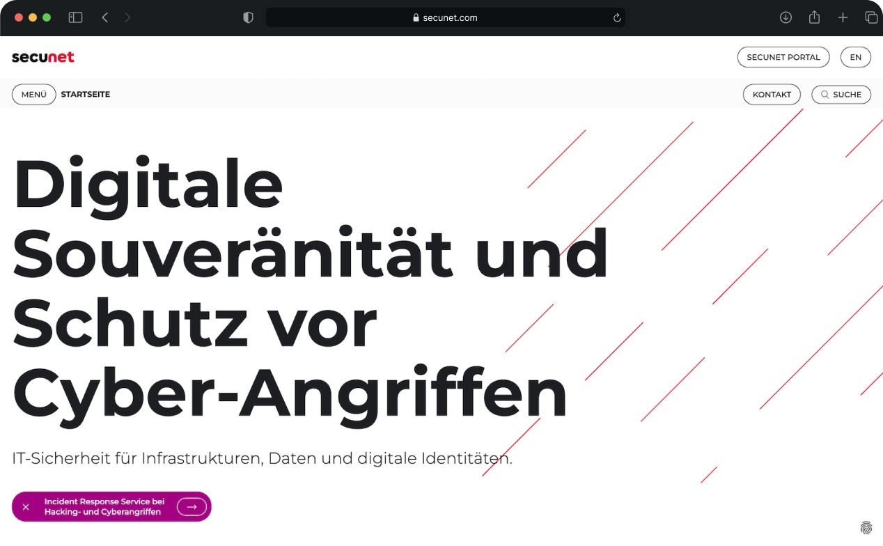
secunet
Designing for Complex Information Security Ecosystems
Designing for Germany’s largest information security company, the project focused on translating a complex ecosystem of software and hardware solutions into a clearer, more navigable, and user-centered structure.
secunet
Designing for Complex Information Security Ecosystems
Designing for Germany’s largest information security company, the project focused on translating a complex ecosystem of software and hardware solutions into a clearer, more navigable, and user-centered structure.
FlussLab
From Fragmented Content to a Sustainable Structure
UX-focused redesign for an interdisciplinary residency platform, introducing scalable categorization, a dynamic CMS, and a responsive interface that supports intuitive navigation and long-term growth.
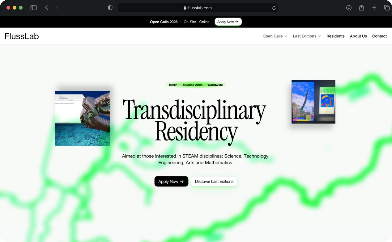
FlussLab
From Fragmented Content to a Sustainable Structure
UX-focused redesign for an interdisciplinary residency platform, introducing scalable categorization, a dynamic CMS, and a responsive interface that supports intuitive navigation and long-term growth.
